The Art of Music: To Kill A King
01/03/2015
Have we lost the art of the album? There have been, in the last few years, several so-called 'think pieces' on such a possibility. This is because - ever since the advent of tape - people love putting songs they adore into an order they feel reflects something they're feeling or a theme they have chosen, or simply makes their music taste palatable to someone else; Spotify and iTunes playlists aren't a new thing. Still, though cassette mixtapes were fine and lovely gifts for friends and family, there was - and still isn't - any substitute for a finely crafted longplayer.
What has been lost a little - in terms of impact certainly - is an album's artwork. Generally seen as the gorgeous archway to a flourishing garden of musical notes and melodies (or coruscating noise and harshness, depending on your tastes), the artwork for an album can completely sway your decision when choosing a record to buy. It could even give you deeper insight into how the musicians were thinking thematically or of the album as a whole piece, as well as allowing them to present their music as they please.
In the first of a (possibly) reoccurring series, we speak to Debbie Scanlan, photographing under the Wolf James moniker, who was commissioned to work on the artwork sleeves for To Kill A King's latest releases. These include the EP Exit, Pursued By A Bear and their second album, To Kill A King, which you can buy now from our digital shop.
Ben Jackson, keyboards, had this to say about the self-titled album's artwork.
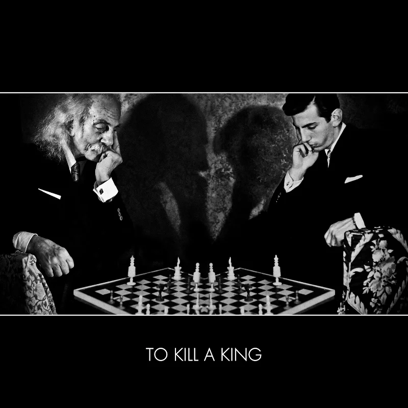
"I see the artwork as more of an interpretation of the title To Kill A King rather than the themes of the album. At a very basic level, it's a game of chess between two people trying to kill each others' kings. But look closer and you'll see the photo is a composite: a young man is playing against himself as an old man. I guess I interpret it as being about the idea of young men becoming their fathers and also the idea that you can usurp a throne, but eventually you will grow old and be overthrown yourself."
Debbie Scanlan, is an Irish-born, London-based photographer and video director, and one half of the director duo, De La Muerte. She's self-trained with 10 years experience, with early work spanning across fashion, fine art photography, documentary projects, portraiture of comedians, actors, sports stars and personalities before moving into music artwork four years ago. From there, it has blossomed into complete creative direction, not only photographing but taking the imagery and working it into longer campaigns and artwork. She's photographed lots of bands (Band Of Skulls, Bastille, Dog Is Dead etc.), worked for various record labels (Sony, Universal, Polydor etc.) and has been featured in many publications (Vogue, Guardian, Clash Magazine, The Sunday Times, Grazia etc.). We asked her a few questions about the experience and the ideas behind the album.
How did you get involved with this To Kill A King project? Were you a fan beforehand, and are you a fan now?
I was approached by an old friend of mine: Ian Dudfield (ex-band member of To Kill A King). I went to school at the infamous Saffron Walden County High, along with (drummer) Jon Willoughby. I had heard 'Fictional State' at that time and had thought they could go far. I love their music. I have toured with them a number of times, made tour videos for them, and if the songs don't drive you mad after you hear them 100 times, it's a good sign! Trust me.
You created artwork for the album and EP. How did you seek to create a cohesiveness between the two? At first glimpse they seem unrelated. How do they relate to each other?
I had shot a couple of publicity shoots for them before, working with Ralph (Pelleymounter, singer) to create the 'Blue Blood' shot and the 'Drowning' shoots, which were awesome to make, and had documented a few of the tours abroad with Bastille. But, with the new album, it seemed natural to take the shots and create a cohesive whole from the get-go. It happens naturally when you work with the same team, but this time there was a plan.
For the EP, those two images are related only by the mood of each. The Hand is actually a self-portrait shot on a beach in Ireland and the Girl in Dark Flowers is another shoot which myself and a friend, Alex Cameron. We were just running around in a field and I threw her into the flowers and shot mid-action. Interesting fact: the dress she is wearing was also worn by Joss from Dog is Dead on their video shoot with me.
I offered the boys a selection of other images with the same dark black and white treatment and when these two were chosen you realise the style is very much the same: out of body experiences, confusing images that take a second glance to see what is going on, or what side is up. It's always fun to mess with the viewers mind and let them decide. Everyone seems to think both were taken in space, interestingly.
Did you have a clear idea of what you wanted to do from the outset or was it very much a collaboration with the band? Did you conceptualise or just let ideas flow and see what happened?
Bit of both really. You can't be too forceful with collaborations!
As I said, for the EP, I offered them a selection I thought would work for them and they narrowed it down.
For the album cover, this was an idea we had after chatting about Taffel's incredible dad Warren, who is a bonafide legend. The image is of Warren playing himself at chess, 45 years apart. The idea of the old and new selves seems to fit perfectly with the direction of the new album for TKAK, and the story behind the image was too good to miss; Taffel had found some old photos of Warren and, incredibly, he had, at some point, been a chess champion.
We found this fabulous image that seemed to tie into the TKAK campaign and originally had intended to simply recreate it. It came to me that we should see if we could try to have him actually playing himself as it would make for an incredible story. We went down to the house to recreate the image and had a lovely afternoon with Taffel's family. Using Ben Jackson's skill on Photoshop afterwards, we tidied up the elements.

Did you use the band's music for inspiration? Do you tend to work to music? If so, what?
Certainly that would have permeated my brain. I had a few years exposure to them all to let their style sink in, but actually - weirdly, especially for someone who works in the music industry - I tend not to work to music, but to rain and thunder sounds, or old radio plays about the supernatural.
Were these original images created especially for the album or ideas you'd had/photos you'd shot before? If the latter, did marrying them to this album give them more resonance for you?
For the EP, they did actually. I have hundreds of images that need a home somewhere, and a brain like a big library, so when I heard the music, knew the bands style and saw what they were leaning towards, I could pick out images to fit it. It's great to see them out there getting a look-in.
The album images were all original.
Did you work differently to how you would usually because of the nature of the project?
Not really. It was a great experience to have that freedom to develop an idea across EP, album and first video ('Love Is Not Control' which you can view here). Really brilliant to pull it all together.
Having the band provide a subject like Warren was different, and wonderful. It's great to have an element that ties back into the band's history. I always like to make the imagery personal in some way, where possible.
Having worked on music projects before, is there anything particularly fulfilling in providing still, visual context for an aural medium? Is there any intention to match the mood of the art within or is it designed to stand alone?
I never think of my pictures as stills; suspended animations, caught mid-action, is more appropriate. They never seem still to me...how strange!
I guess pictures give you time and room and the headspace to make up your own ideas about what you are hearing and seeing. Though we always like to leave it up to the viewer - even in videos - a still image has that calm, like a written letter, that your eyes can wander away from and come back to again and again. It's like a little memory thumbnail to remember the moment, a reference point for your brain to recall the music.
Stimulation of all the senses is essential; I always loved book covers and the work of Ed Rushca - words on pictures! It makes both mediums more than the sum of their parts. Lots of levels are essential to get a deeper reaction out of your audience. Yes, the mood of the image's relation to the aural medium is key.
So, definitely both, though the images themselves may also stand alone but with the context of words or lyrics, it frames them so much better. Album artwork is the ideal medium for me in that sense.
There are probably plenty of people who would love the chance to craft art for their favourite band. How did you find your way into producing artwork for bands and musicians? Do you have any tips for budding artists and photographers?
It was a natural progression and an invitation by friends. I had worked extensively on all kinds of projects and found my style over years and years, being open to whatever I came across and also trusting my own judgement on taste and style. It's all about listening - to your client, your subject or the setting itself. It's not rocket science, but it is about being intuitive. I was trained as an artist by my mother and, though I no longer paint, that same background informs the way I make artwork with photos today.
With all that said, here are a few tips for the budding photographer wishing to get into a similar line of work:
- Do a few (not endless) low paid projects for love and experience. Learn about your subjects - its a two way thing - its not all about the tech when you are doing projects with other people.
- Be open - do not restrict yourself to just one genre as you won't learn anything new to inform your style
- Take LOADS of pictures
- Develop your own style based on what you are good at after you look back over thousands of images
- Don't worry about what everyone else is doing
- Don't undersell yourself
Your praise for To Kill A King
You know how much we like your loveliness. Here we are, showing your effusive praise off for everyone to see. Anyone who has bought or streamed the album can tell us what they think via Twitter @Xtra_Mile, Facebook, Instagram @xtramilerecordings, and Snapchat @Xtra_Mile. Go on!
DISCLAIMER: Tweets left unedited.
@bearskinband: @Xtra_Mile @ToKillAKing @Spotify We're listening to it and rather liking it! "Grace at a party" ...very nice.
@Swafters: @Xtra_Mile @ToKillAKing My signed CD arrived today, it's on repeat!!
@traci01420: should have 5 stars...
@28_kathrynbrown: @Xtra_Mile @ToKillAKing bloody amazing I love it xx
@HeyIts_Lauren: @XMRstreetteam @ToKillAKing @Xtra_Mile ITS BLOODY GORGEOUS
@SheraldineM: @Xtra_Mile @ToKillAKing I love it so much! Although every song is different, they're amazing in their own way.
@LeneMusic84: @Xtra_Mile @ToKillAKing What should I say? I'm so annoying.. But I can't help myself: Their music is so incredibly awesome! Looking forward 4 my copy to arrive +in the meantime I love the opportunity to stream it via Spotify.So brilliant! Also so so thrilled since weeks to see them finally live very soon for the first time! I wish I wouldn't be so annoying, sorry - but I'm so full of pleasant anticipation!
@SToRMeR_Fleur: @Xtra_Mile @ToKillAKing I'm still waiting for my CD, but I can't wait! Until the Cd comes, the album is on repeat on Spotify!!
@HollieDShepherd: Was waiting for me after work, I love the pic of @Ben_TKAK Great album! @XMRstreetteam @Xtra_Mile @ToKillAKing
Heard (or just bought) the album? What do you think? Let us know on Facebook, Twitter @Xtra_Mile, and on contributions[at]xtramilerecordings[dot]com. What are some of your favourite album artworks? What would you have on your album sleeve? Do you think artwork is important anymore? Get at us and perhaps we'll use some of your responses next time. Cheers!