The Art of Music:
Million Dead's 'Harmony No Harmony' by Evan Cotter
08/2015
It's been a long time. Ten years, actually. Ten years we've been without a vinyl version of either of the Million Dead albums. Now, Xtra MIle have seen fit to release Harmony No Harmony — the band's excellent, second album — on double, transparent yellow vinyl. You can buy it from our digital shop.
As well as being on vinyl, the band have seen fit to alter the artwork for the vinyl release. Its new cover has been designed, crafted and produced by Evan Cotter. We wanted to ask him a few questions about this, as well as his feelings about album artwork in general. Read on for enlightenment.
You created the revised artwork for HNH. First, where or who did the idea come from and what does the revised artwork mean to you as an MD fan and as someone who does art and design stuff?
Ben Dawson came up with the idea of the extinguished match on the cover, which I felt was a stroke of genius and was instantly annoyed that I didn’t come up with it myself. Beyond that though, I was basically given free reign. I felt that it was important to include as much of the original artwork as possible, as the drawings by Richard Fowler (Tom’s dad) are fantastic. In the end I was able to use all but one of the images.
In most circumstances, when the artwork reaches me it is essentially a finished product. My job is to make sure that everything is ready for print. This generally means getting the artwork fitted to templates, and ensuring everything meets the pressing plant’s requirements. Some jobs are more straightforward than others, but it’s rarely boring.
Of course, projects like this one don’t come along every day so I really got my teeth into it. Without wanting to give it the big 'I am', the finished product came out great. I am reasonably confident I did it justice. I was particularly pleased with how the labels turned out, and that the Polaroid pictures are life size now. People whose opinion matter to me have been complimentary, so with a bit of luck everyone else will like it too.
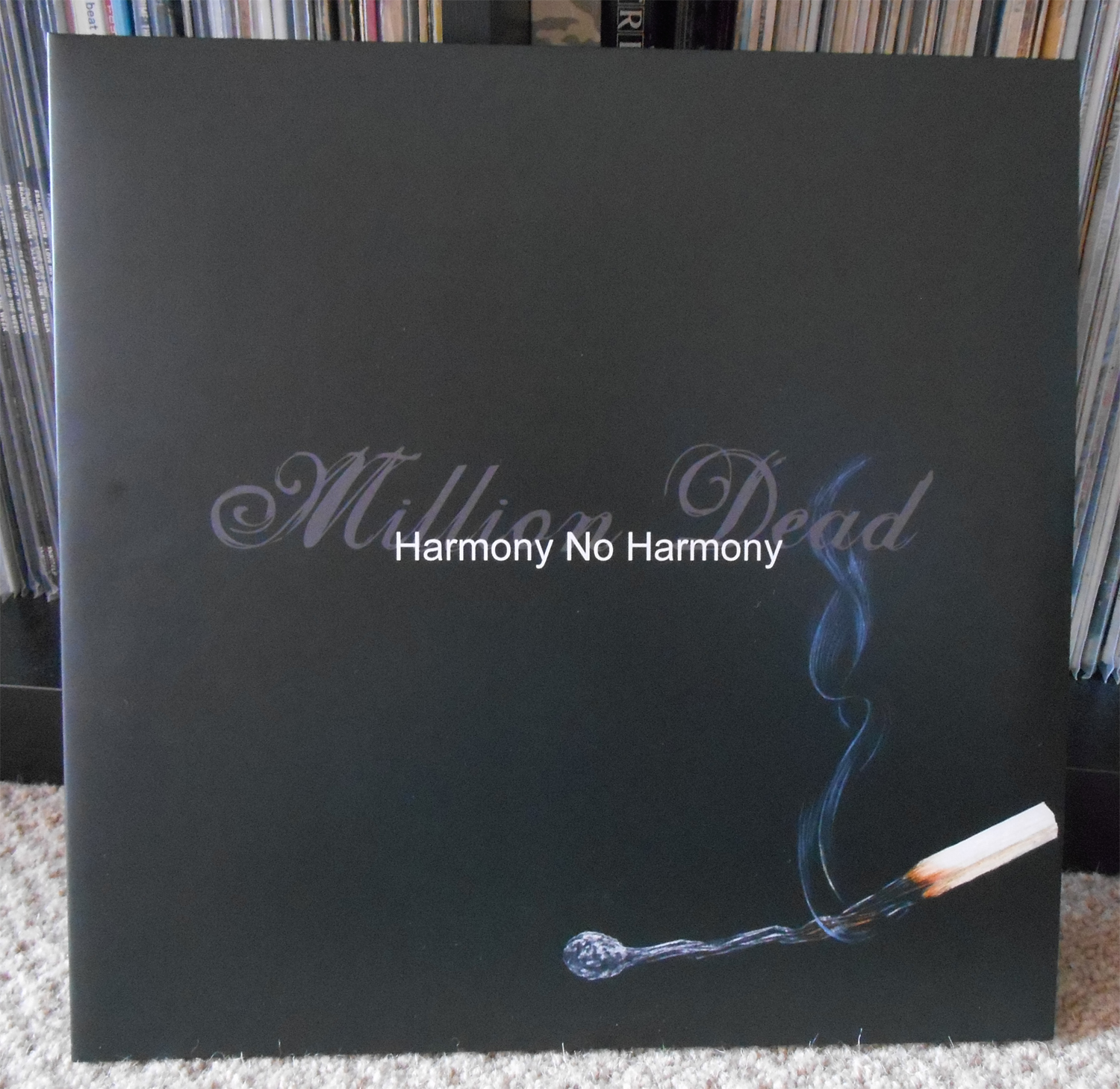
Evan's personal copy of Harmony No Harmony sporting his new cover
Where there any particular challenges in getting this artwork as you wanted it? Did you think about how people might feel about the artwork being changed?
There were a number of challenges, not least that all the original artwork has vanished into the ether. I am pretty sure the actual drawings were given away in a competition (which I also remember stating to be a terrible idea at the time), so the only files available to me were the original CD print files supplied by the pressing plant. I can’t even begin to tell you how long I spent isolating all the images and getting them print-ready. Up until the point I actually got the finished product in my hands, I was quietly bricking it that it was going to look awful.
The second, and far greater challenge, was the lyrics. The files I was given were not editable, which meant typing it all out again. Under normal circumstances, this isn’t such a big deal. However, Frank has never been a “yeah, yeah, baby, baby” type of lyricist, and he often uses words that I barely understand, and struggle to spell. It did occur to me that the internet might have already saved me the trouble, but it turned out that fixing the spelling mistakes and line breaks would probably take longer than writing it all out again, so I had to suck it up and type out all 2954 words myself. It was long. Amusingly though, it lead to a never-to-be-repeated scenario where I actually had to correct Frank on a couple of his lines. He took it well.
I can’t say I gave much thought to how people might feel about the new artwork. Personally, I actually prefer the new cover. The only thing that seemed important during the design stage was making the band happy. In the end it was a really smooth experience, as everyone seemed to be agreement about what they wanted to achieve...which was probably a first for them. Hahaha!

Simple perfection
What does it feel like to be able to work on record sleeves in general, let alone of a band or bands you love/d?
It’s always pretty exciting working with bands you like, but I think this is the first time I‘ve had a personal connection to the work I was doing. Million Dead are a band that literally changed the course of my life, and the period around this album was when I was most involved with them. I associate a huge number of happy memories with that time. They gave me somewhere to live when I was homeless, and introduced me to my wife, for which I owe them a debt of gratitude. They even let me sing backing vocals on 'Father My Father', so it was important to get this right.
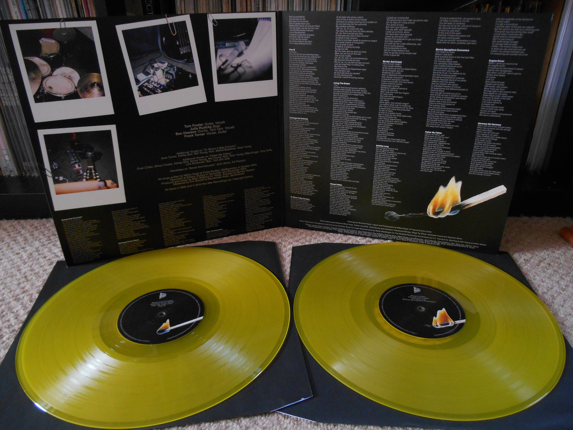
The match burning down throughout the labels and sleeve is a nice touch
What are your favourite artwork sleeves? Why?

Minor Threat's 'Filler' 7" artwork
I have been giving this a lot of thought, and I don’t think I can answer this one. Record sleeves are a genuine art form as far as I am concerned. Just like any painting in the National Gallery. They may not always be as technically accomplished or historically significant, but they can evoke feelings in people just like a Picasso can. Therefore picking a favourite is nigh on impossible.
However, I have always been a big fan of covers they convey some sense of what you’re about to listen to. The cover of the 'Filler' 7” by Minor Threat is a perfect example of this. Before you hear a note, you know it is going to be intense. That now iconic image of a skinhead sitting hunched over on some steps was so good they used it for two other releases — both compilations of course, but still…twice! And for the trivia fans out there, that is not Ian MacKaye, as most people seem to believe, but his brother Alex. And the steps in question are at the 9:30 Club.
I am also keen on extravagant packaging. The first pressing of Meanderthal by Torche on LP came in an elaborate die-cast cover, with several panels that fold out to reveal some insane artwork by Aaron Turner. (You can see it here. - XMR) The Melvins are also absolute winners when it comes to this. The vinyl release of (A) Senile Animal featured four one-sided 45 rpm LPs, etched on the 'B' side, contained in a four-panel book-like cover with picture inners. It is a thing of magnificent beauty and the most expensive record I own. (Behold the beauty here. - XMR)
I could wang on about this kind of thing for eternity, so I will just stop. (But we want to hear more! - XMR)
How are you feeling about the HNH artwork? Do you think it does the album justice? Do you prefer the original or think Ben and Evan got it right? Do you think we should give Evan his own occasional vinyl column (we don't think he'll have time for a regular one)? Let us know on Facebook, Twitter @Xtra_Mile, and contributions[at]xtramilerecordings[dot]com.