
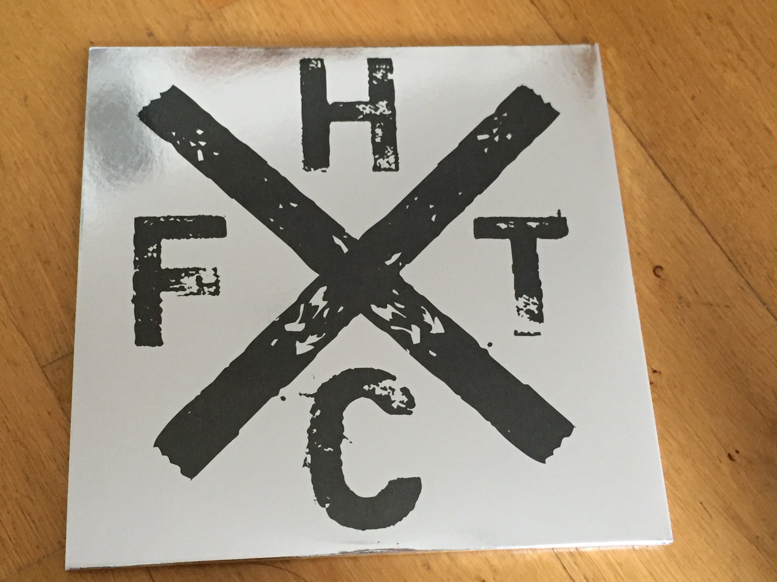
A Cover Version: Altering the Artwork For Love Ire & Song Tenth Anniversary Edition
- 8 / 06 / 18 -
Evan Cotter at OneThirtyEight Design answers our questions on the excellent new artwork and sleeve for Frank Turner's Love Ire & Song Tenth Anniversary Edition reissue, released June 2018. He tells us about iddeas, techniques and gives vital tips for freelancing.
You can buy Love Ire & Song Tenth Anniversary Edition on double gatefold 180g clear vinyl from the Xtra Mile shop. Red (Lost Evenings II exclusive) and gold (Banquet exclusive) is sold out. White is Europe-only and a traditional black version is available generally.

The last time we spoke, you hadn't yet seen the SIFTW vinyl. Did that come out as you hoped as you were pretty excited about it? What are you most proud of on that one?
Yes, I was very pleased with how SIFTW came out. My only small regret is that I think we should have made the gatefold a gloss finish instead of matte, but that was something I wrestled with for ages and think no matter what I chose it would have been wrong in my head. Maybe if it gets a repress.
As for what I am proudest of - in a probably never to be repeated scenario, I actually prefer the CD version of this one. I was extremely pleased with how the vinyl came out, but I thought it just all came together excellently for the CD.
I think quite a few people would agree that you're rather fucking good at these vinyl reissues. Having done a remarkable job with SIFTW, did you have a plan in mind for LIS ahead of time?
That is very nice of you to say and I will certainly take the compliment, but I would suggest it is essentially like doing a cover version. Whatever the outcome, and however much I make it my own, it’s still someone else’s work. So therefore there is only so much credit I can allow myself to take.
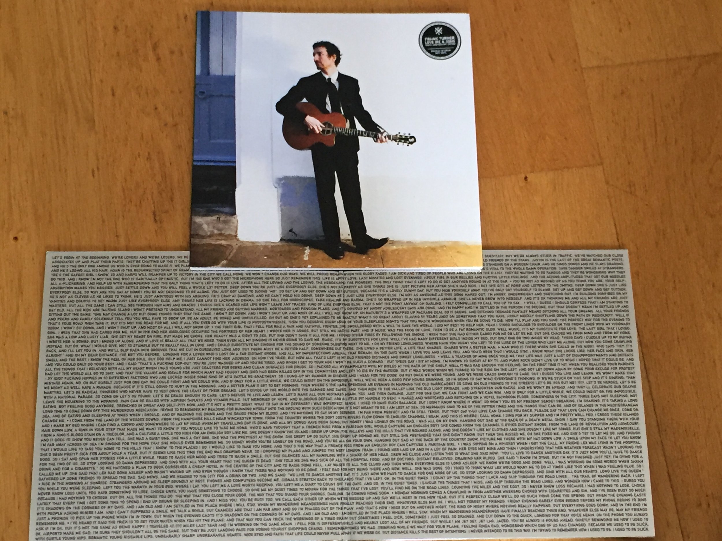
I didn’t really have much of a plan for LIS if I am completely honest. We did a reissue of it not that long ago where I felt I had righted the wrongs of the previous pressing, and was more than happy with how it came out. All I knew is that I wanted the original untreated picture on the slipcase, which Greg Nolan managed to dig out for me. Other than that I just wanted it to be different from the previous versions, and there was a number of different ideas put forward before it was finally settled.
When a project is given the go-ahead, do you have a strict process that gets you from concept to finished product?
No. I would say the only constant is that I have to be in the mood to do it. Otherwise I end up doing nothing, or having to go back and fix everything.
As we see on CP, SIFTW and LIS, you reinterpret the artwork so that it still retains its identity but is easily distinguished from the older versions. LIS 10 looks especially like a luxury special edition. How did it feel to be exploring how to tackle the artwork on LIS?
Unlike SIFTW, there was not really an abundance of material to use for this one. Chris Pell had supplied loads of drawings for Sleep, and Frank rather conveniently still had them all on file. The hardest part of that job was picking what to use.

But with LIS there really wasn’t a lot going on. I was extremely worried at one point that we wouldn’t be able to pull it off. There was some other shots from the same photo session as the cover that Greg supplied, but in the end it didn’t really work and felt like trying to shoehorn in the extra images just for the sake of it. Which lead to the idea of just using text for the gatefold.
Where did the idea for the mirror-board gatefold sleeve come from? Were there challenges in working with that over a usual material or is it exactly the same?
I’ve long been a fan of mirror-board sleeves, although it is not something you see too often. The reason being that it’s bloody expensive. The original idea was to have the LIS embossed on the sleeve, which would have looked incredible but was shot down due to expense, as they need to create a machine part or something. Then I thought about doing a die-cut on the slipcase, with the Nolan image on the gatefold. But again the cost of doing that would have made the sale price too expensive. It wasn’t until the 11th hour I realised we could get the mirror-board in under the budget if we printed on it rather than embossing it, which was an exciting moment.
In the end the only concern with the mirror-board was how the black would look against it. The cheapest option was to use a black spot gloss, with no white knockout underneath. This meant that the black would be slightly see-through against the background, rather than sitting on top of it (if that makes sense). I figured there to be a fine line between it looking good and looking rubbish, so it felt like a gamble and I would be lying if I said I wasn’t worried how it would come out. But it came out even better than I expected so that was a relief. Frank proclaimed it “one of the sexist fucking things I have ever seen”.

You get to play around with some fun ideas - ie spot gloss on the PotD / EKMB sleeves, mirror-board, quotes on the opposite side of the gatefold spine. Are there any more options you'd love to incorporate in future releases?
Every project is different, and I am continually looking for new things to try. Spot gloss is a lot of fun to use, and as mentioned previously I am really keen to do embossing and die-cuts. I also have a massive interest in bespoke packaging, but at the end of the day it all boils down to budget. So it’s only really the records you know will sell (such as Frank) that you’re allowed to explore those avenues. Perhaps one day I will achieve a status within the industry where people come to me with their massive budgets and I can be super creative, but for the time being I will bide my time dreaming up ideas no one will pay for.
Do you have a say in vinyl colour choices or is that very much someone else's decision and do you ever work with potential vinyl colour in mind?
I don’t have the final word, but I certainly make suggestions. I think you should always try and match the colour of the vinyl with the cover. But at the end of the day it is the artist’s choice, so I try not to get too attached to my choices.

What would you say is the most underappreciated aspect of the entire vinyl package in terms of your work on it?
I could say something like making the legal text and barcode work with the rest of it, but I think the most underappreciated thing is the job the printers do. There is a significant difference between something well and poorly printed. For instance I worked on a project last year that came on three different formats. Two were handled by one printer, and the third was done elsewhere. On the two that were done together the colours are inconsistent across the formats, which really got my goat. But the third one was perfect. Everything was as it should be, and holding the end result in my hands was one of my proudest moments I have had in this job. So it just goes to show how two different places might handle the same artwork differently, and that clearly more care and attention is given at some places than others.
Your work is getting to be seen by lots of people around the world. Does this please you, put you under more of your own pressure or have no effect at all?
It’s certainly pleasing when people say nice things about projects you’ve worked on, but it’s not something I give too much thought to. I am not in this for the glory but I would be lying if I said I didn’t get a buzz when I discovered I have my own Discogs page.
Have you seen any design ideas recently that you wish you could've thought of first / might steal?
The last Converge record came printed on holographic paper, which looks incredible and if ever I find myself with that kind of budget then I would love to try working with that.
Being a freelancer can be hard: any tips for any XMR fans who are going into business for themselves?
Apart from the obvious – work hard, be reliable, and save every penny you can for when there’s no work - I would suggest that some freelancers have the ability to torpedo their own careers by acting like dicks. With this in mind…
Be polite. It costs nothing. Not everyone you work with will be nice, or show you the respect you may feel you deserve. But a well-mannered approach for even the most ill-mannered of clients will serve you well. Firing off pissy emails will achieve nothing other than satisfying your desire to vent. Sometimes you just have to suck it up.
Don’t get complacent. I think one of the major pitfalls for freelancers is overestimating their worth, both financially and relating to their place within the grand scheme of things. You might feel like an important part of the operation, but this is a competitive world and it is a buyer’s market you should never believe yourself to be irreplaceable. If you want to retain your regular clients, then you need to consistently work hard for them.
And finally, always act like a professional. This seems like a total no brainer to me, but it shocks me how many people don’t appear to see it as such. If you are off on Twitter bitching about work, it is not inconceivable that your clients or colleagues will see that. Everyone has problems. Everyone has bad days. But you really need to maintain a barrier between your personal and professional life. Your clients only care about their work getting done, and you would be foolish to think otherwise. Therefore whether you have a hangover, or you are sad, or angry, or whatever – you need to deliver the work you promised, when you promised it, to the standard that they expect. It astonishes me how many people don’t seem to get that. The world is full of unreliable people. Don’t be one of them.